
A New, Simple, Comprehensive Measure of Fund ‘Active-ness’
- Peter Elston

- Dec 1, 2017
- 5 min read
Updated: May 25, 2022
In the spirit of Christmas, I present in this final letter of the year some truly psychedelic charts!
"I guess he’d never heard of Warren Buffett"
2017 saw the debate (ok, it’s a war) between active and passive intensify further, with flows into passive funds, ETFs and smart beta products reaching unprecedented levels. In this letter I put forward a suggestion for a comprehensive but simple measure of the ‘activeness’ of a fund. This I hope might provide an easy way to distinguish between ‘good active’ and ‘bad active’ and thus determine which active funds stack up well against their passive equivalents.
The ‘activeness’ of an active fund tends to get measured in various ways. It has also at times been ill defined, and by those who should know better. Nobel laureate William Sharpe said, “An active investor is one who is not passive. His or her portfolio will differ from that of the passive managers at some or all times. Because active managers usually act on perception of mispricing, and because such misperceptions change relatively frequently, such managers tend to trade fairly frequently – hence the term ‘active’”. Trade frequently? I guess he’d never heard of Warren Buffett and the many other great long-term investors.
Yale CIO David Swensen on the other hand got it right. He wrote that, “There is no way to succeed in active management if you try to control for benchmark risk. You must be willing to deviate from the benchmark if you want to earn returns commensurate with the risk of owning equities. And you must be patient.”
Here then in Swensen’s simple words are the two key requirements for active management: deviating from the benchmark and patience. Put another way, good actively managed funds must be concentrated and long term.
This proposition is both logical and empirically well supported (I will not elaborate here but I have written about both concentration and time horizon in relation to investment returns on previous occasions). However, I have yet to see a study either by an academic or practitioner that combines both portfolio concentration and portfolio time horizon into one score or measure. The two always seemed to be considered separately.
And that may be because many do not see the link between concentration and time horizon. I suggest there is a clear, logical link between the two and also that there is a way to measure both at the same time.
Chart 1 below is a so-called soil chart, depicting the positioning over time of an actual investment trust (psychedelic man!) Note that totals in excess of 100% imply net gearing, while totals less than 100% imply net cash. The large mauve band represents the introduction of a fund to gain exposure to a particular country. The rest are individual equities.
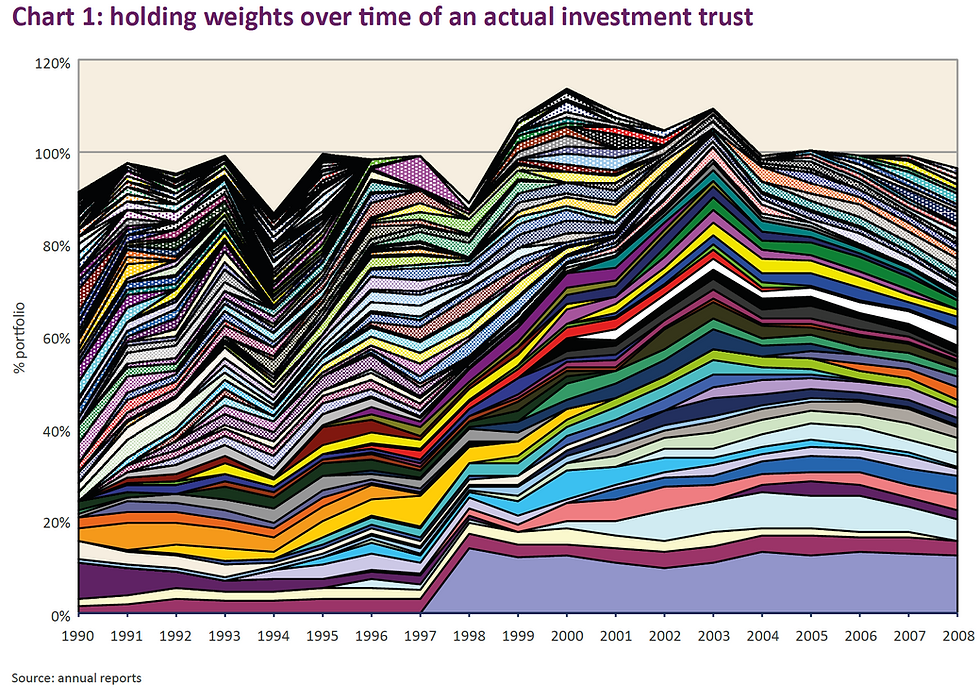
It should be clear that the portfolio concentration of the fund can be understood in terms of the width of the lines while portfolio time horizon in terms of the length of the lines. The point is that both concentration and time horizon measure the exposure of a fund to a particular holding, one in terms of ‘how long’ and the other in terms of ‘how big’. Being active is not just about being high conviction but also about how long you hold something.
Both concentration and time horizon can be measured at the same time by considering the area of each line, then calculating the average line area. The area of each line would be the length of the line multiplied by the average width. All the data required for this calculation is readily available in the chart data, which is available within our annual reports.
Funds with a low average line area are thus lowly concentrated, or short-term, or both, while those with a high average are highly concentrated, long term, or both.
The units for this measurement would be % times ‘time’ since the x-axis is ‘time’ while the y-axis is ‘percentage’. A standard unit could be ‘% months’ (if data is monthly) or ‘% quarters’ etc. The higher the score, the more active the fund.
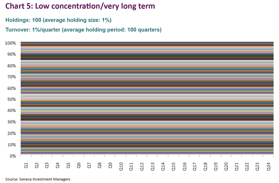
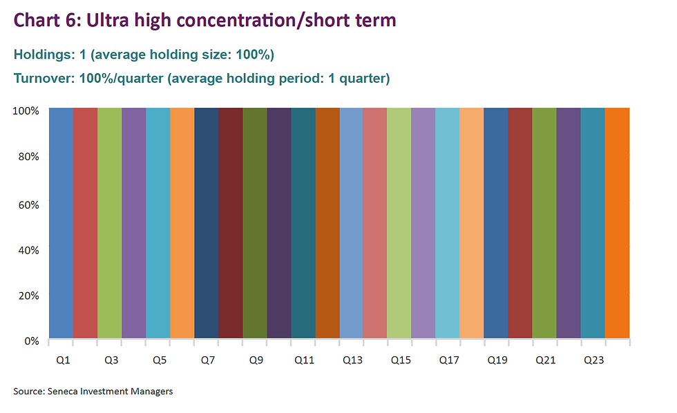
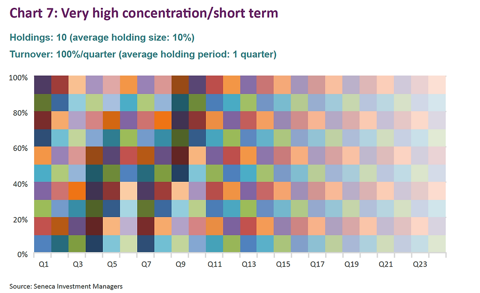
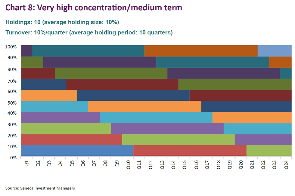
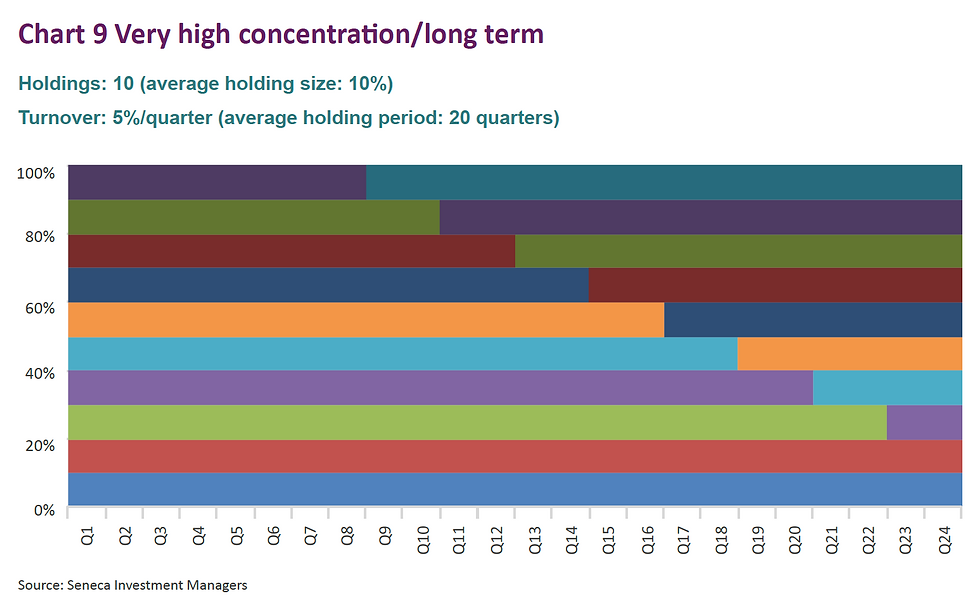
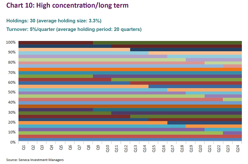
The charts below are highly stylised representations of funds that would fit into various categories, starting with the two extremes (low concentration/short term and high concentration/long term).
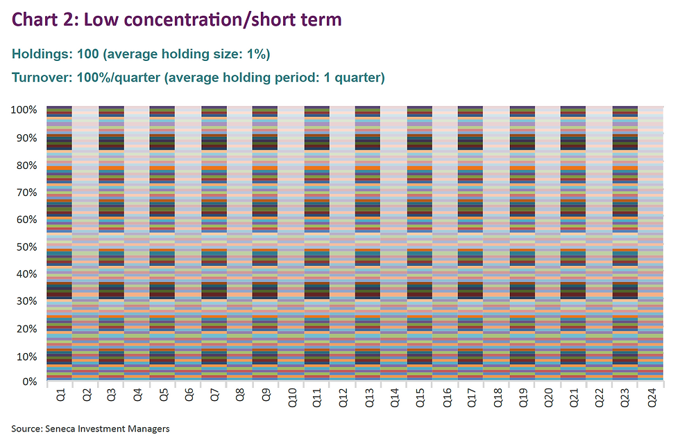
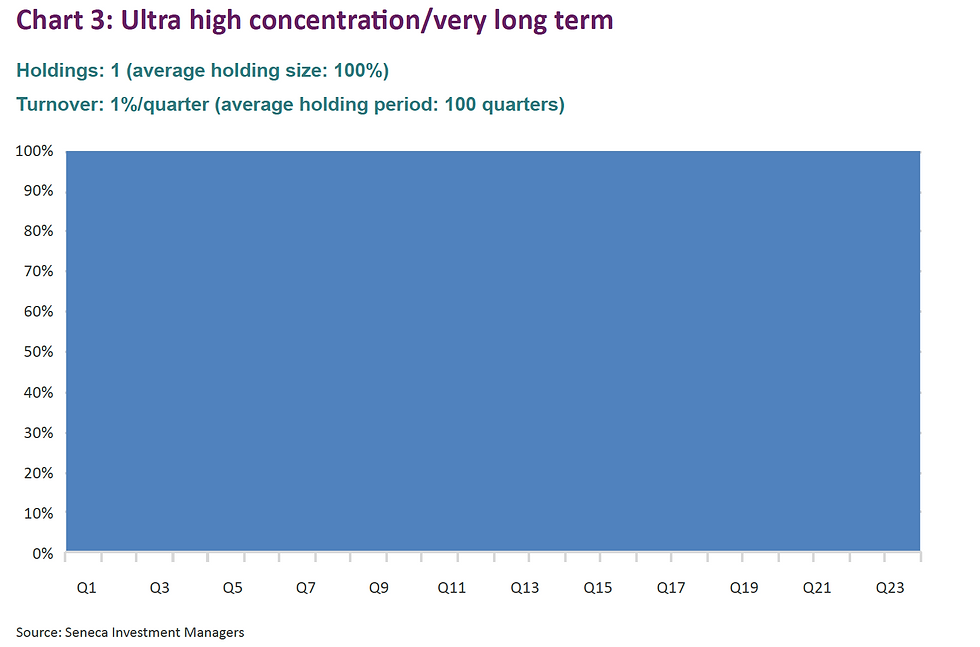

Now, I bet you never realised that funds could be so beautiful!
More seriously, we can calculate the average area of each “line” in ‘% quarters’ as per the below table.
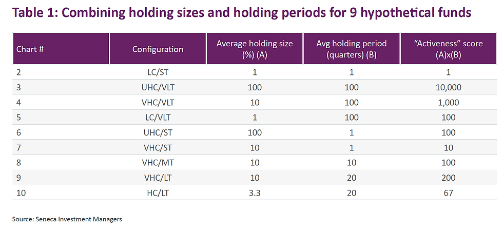
Interestingly, there are three configurations that deliver a score of 100 (charts 5, 6 and 8). Clearly, the fund that has just one holding but changes it every quarter should not be awarded the same score as a fund that more sensibly has 10 holdings and changes them on average every 10 quarters (2 and a half years). The same goes for chart 3.
In other words, there must be an optimal holding size which should be rewarded more than holding sizes that are either bigger or smaller. This can be achieved by normalisation of the data.
As for average holding period, let us propose that the optimal average holding period is 20 quarters (or 5 years).
So, if we can agree that chart 10 has the optimal mix of concentration and holding period (academic evidence supports such a suggestion), this then is the chart that should receive the highest aggregate score after data normalisation.
Table 2 below sets out scores for each of the nine funds after data normalisation (I am happy to share the details of the process of normalisation of data upon request, suffice to say it is purely systematic).
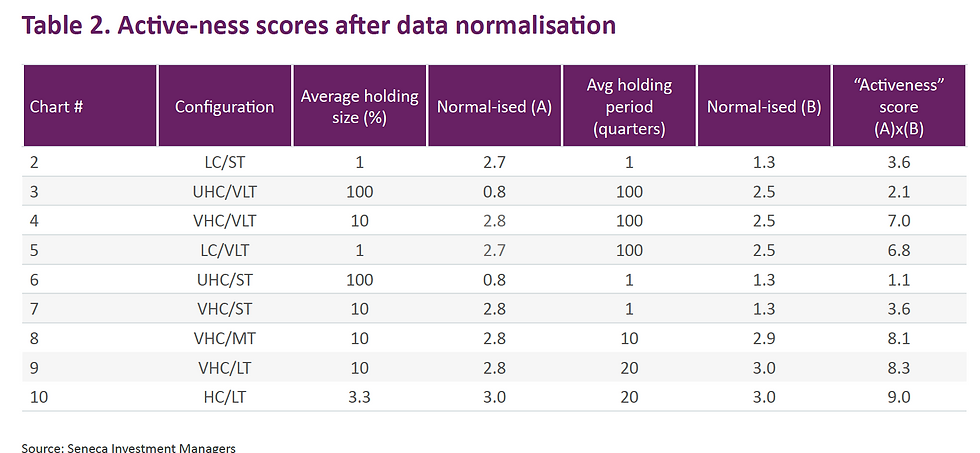
The two funds that only have one holding now score very lowly which has to be correct. The next lowest scores are the funds that have very high turnover. Chart 10 has the highest score of 9 which is also consistent. Charts 8 and 9 are not too far behind which feels about right.
There is no doubt that a trained statistician could do a better job of normalising the data and also of interpreting academic evidence with respect to the optimal holding sizes and holding periods that have tended to produce the best performance.
However, applying the above methodology to the actual investment trust data cited earlier provides an interesting insight. Average holding size is 1.7% and average holding period is 14.5 quarters. This generates a high “activeness” score of 8.7 which is thoroughly appropriate. The fund in question is Aberdeen New Dawn, and during the period in question it returned 1918%1 compared with its benchmark, the MSCI AC Asia Pacific ex Japan index, which returned 1127%.
If there is a trained statistician out there who would like to collaborate on turning this into a more formal research paper, I would be delighted. The objective of course would be to determine if there is a correlation, presumably positive, between the active-ness score and investment performance. If there is, that I think would certainly be interesting.
Happy Christmas everyone!
Published in Investment Letter, December 2017
The views expressed in this communication are those of Peter Elston at the time of writing and are subject to change without notice. They do not constitute investment advice and whilst all reasonable efforts have been used to ensure the accuracy of the information contained in this communication, the reliability, completeness or accuracy of the content cannot be guaranteed. This communication provides information for professional use only and should not be relied upon by retail investors as the sole basis for investment.


Comments